Settings Console
Dev-ready
An admin console where one wrong toggle could silently rewrite a customer's contract, redesigned in 8 weeks at Coditas, refined independently in 2026.
Designed and approved at Coditas in 2024. The build slot was later reassigned to higher-revenue features, so it did not ship. I refined the spec independently in 2026.
Client
A patented Silicon Valley sales platform
Brief from
The client's CEO, 'stop the silent breakages'
Team
Sole designer · 2 exec sponsors, eng lead, CS lead in review
Users
2 platform admins via open card sort · CS team for risk patterns
Role
Product Designer (sole designer on this surface)
Platform
Web · Enterprise · Admin Console
Duration
2024 → 2026 · 8 weeks at Coditas · refined independently 2026
In short
- The problem: a decade-old admin console with 142 settings in one long scroll, no search, and no safety, where a single wrong toggle could rewrite a customer's contract.
- The key decision: organize by the task an admin does. A card sort collapsed 30 blocks into 8 task-based groups.
- Two patterns carry it: a Command-K palette (typed intent in under 2 seconds) and a dependency-review modal that shows a before/after diff before any risky save commits.
- Status: approved at Coditas with 3 sponsors aligned, then shelved when the roadmap moved. I refined the full spec, including token-level WCAG 2.2 AA, independently in 2026.
What it moved
The numbers, in plain sight.
142
Settings audited & rationalized
30 → 8
Navigation compression
≤ 2s
Time-to-target (⌘K, target)
100% AA · 75% AAA
WCAG 2.2 conformance
The story · 8 chapters
How Settings got built.
rev 00brief
What the console had become.
❝The admin console had been growing by accretion for a decade. 142 settings, down one page, in 30 vertical blocks.
The problem was not that it was ugly. It was risk.
Pull-out · Brief
30 blocks
V1 vertical scroll, no search
| What the console did | What it cost |
|---|---|
| No search anywhere on the page. | 8 to 22 seconds to reach a setting you already knew the name of. |
| No grouping that matched how admins work. | Finding anything meant scrolling and scanning. |
| Saves were implicit. | You could not tell what you had just changed. |
| Deprecated toggles sat next to load-bearing ones. | Nothing on screen marked which was which. |
| One click could cascade into billing, permissions and integrations. | A signed contract could be rewritten before anyone noticed. |
The CEO's brief was one sentence. Stop the silent breakages.
rev 01investigation
What I cut first.
❝Before any new frames, I had to stop the bleeding.
I exported the whole V1 page as one continuous screenshot and marked every setting in red and green. Keep, deprecate, hide, move.
That one artifact replaced a 30-question stakeholder doc.
Two exec sponsors, the eng lead and the CS lead aligned in two meetings. 13 legacy settings were deprecated or hidden before architecture work started.
Alignment is a design problem. The right artifact moves more weight than the right meeting.
Pull-out · Investigation
13 settings
Cut before a single frame
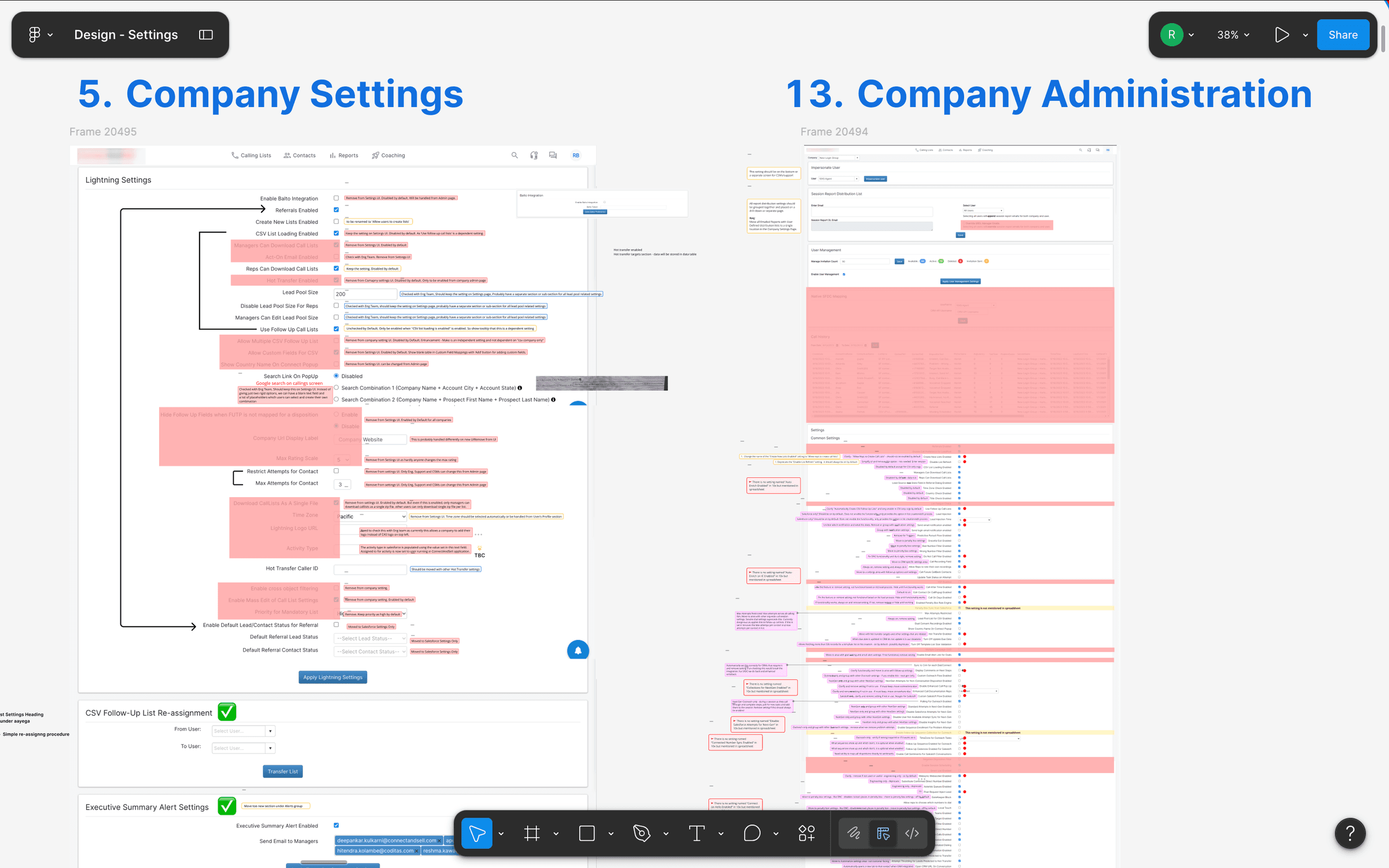
Annotated V1 audit, Company Settings and Company Administration exported as continuous screenshots, with every block marked keep / deprecate / hide / move.
rev 02decision
Grouping by task.
❝My first attempt kept the old mental model. A sidebar organised by the backend subsystem each setting came from. Cleaner. Still unsurvivable.
So I ran an open card sort with 2 platform admins.
The pattern showed up in the first session. Admins do not think in subsystems. They think in frequency.
Things I do every Monday, against things I touch once a quarter.
30 blocks collapsed into 8 task categories. That number is not arbitrary. It sits inside Miller's 7±2 ceiling, so an admin can hold the whole map while they work.
Pull-out · Decision
30 → 8
Subsystems → tasks
Working memory holds 7±2 items; navigation that fits inside this budget stays usable; navigation that doesn't, doesn't.
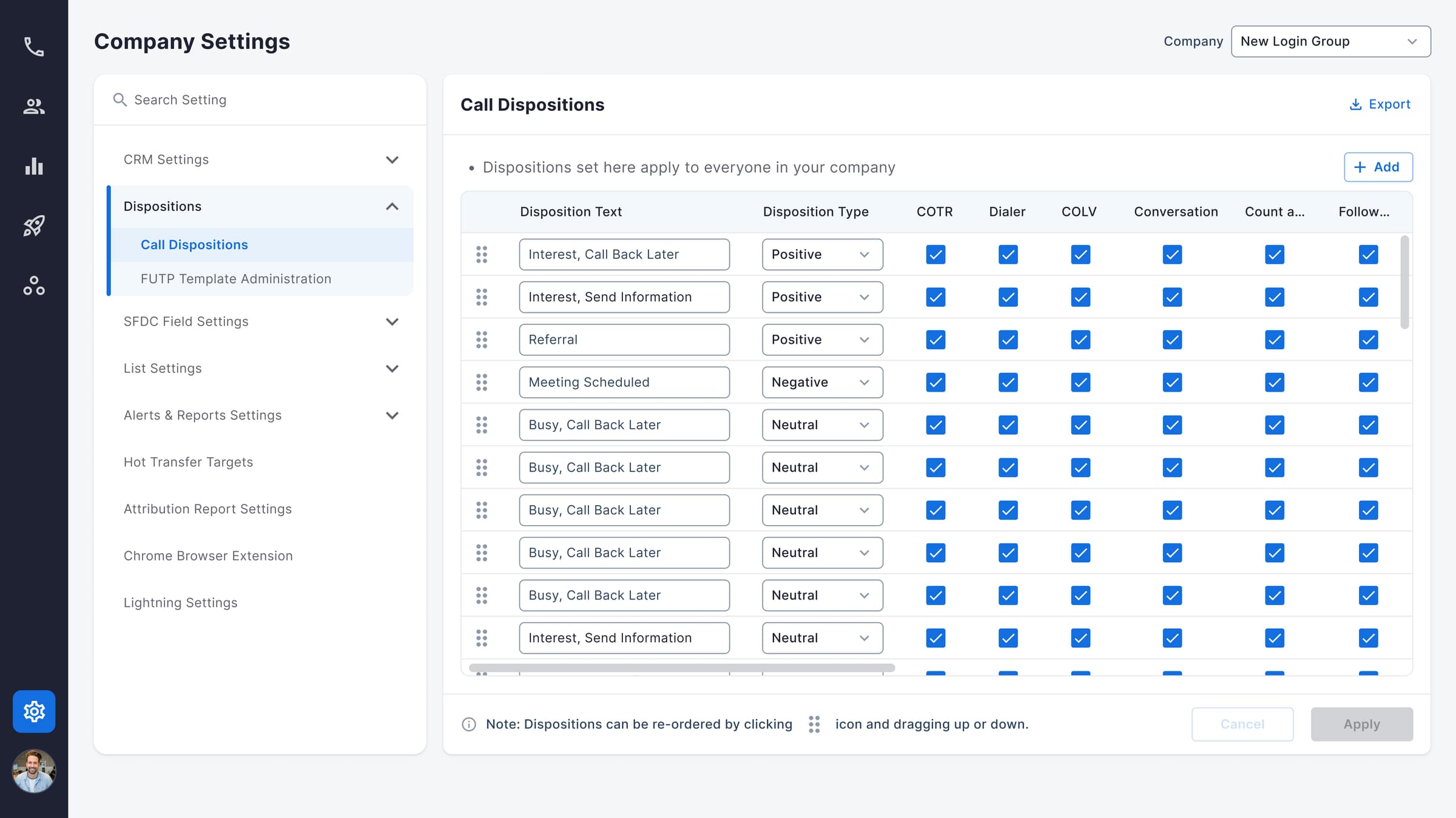
V2 dispositions, sidebar groups settings by subsystem (CRM, SFDC, List, Alerts); a cleaner shell, but still organized by the backend that produced each row.
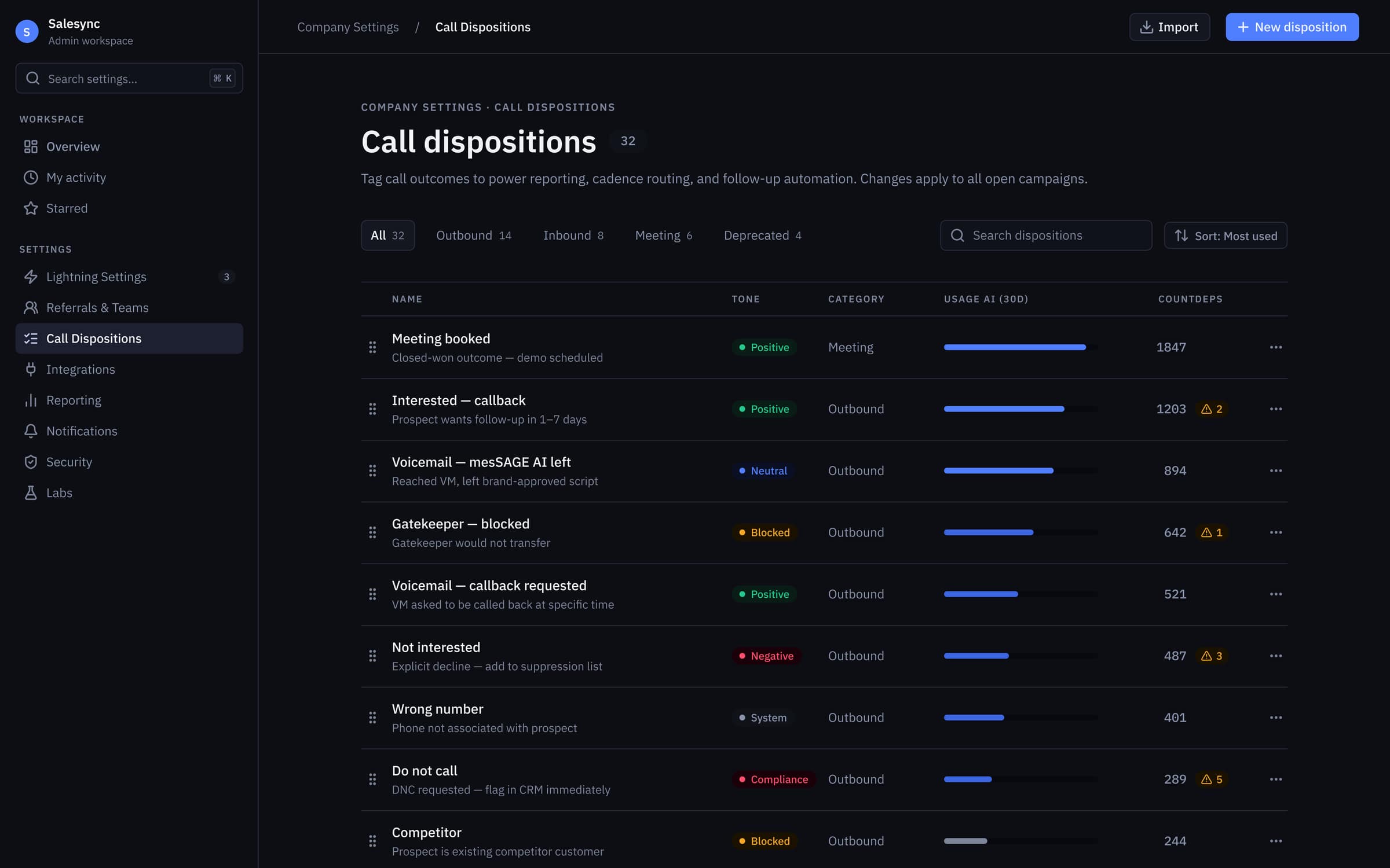
V3 dispositions, task-based tabs (Outbound · Inbound · Meeting · Deprecated) with 30-day usage bars and dependency-affected counts, so admins triage with signal instead of guesswork.
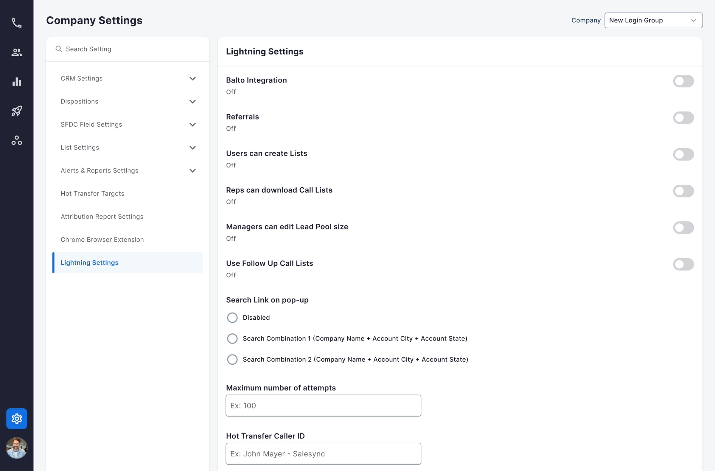
V2 Lightning Settings, toggles rendered as an undifferentiated stack, with no hint that flipping one cascades into others.
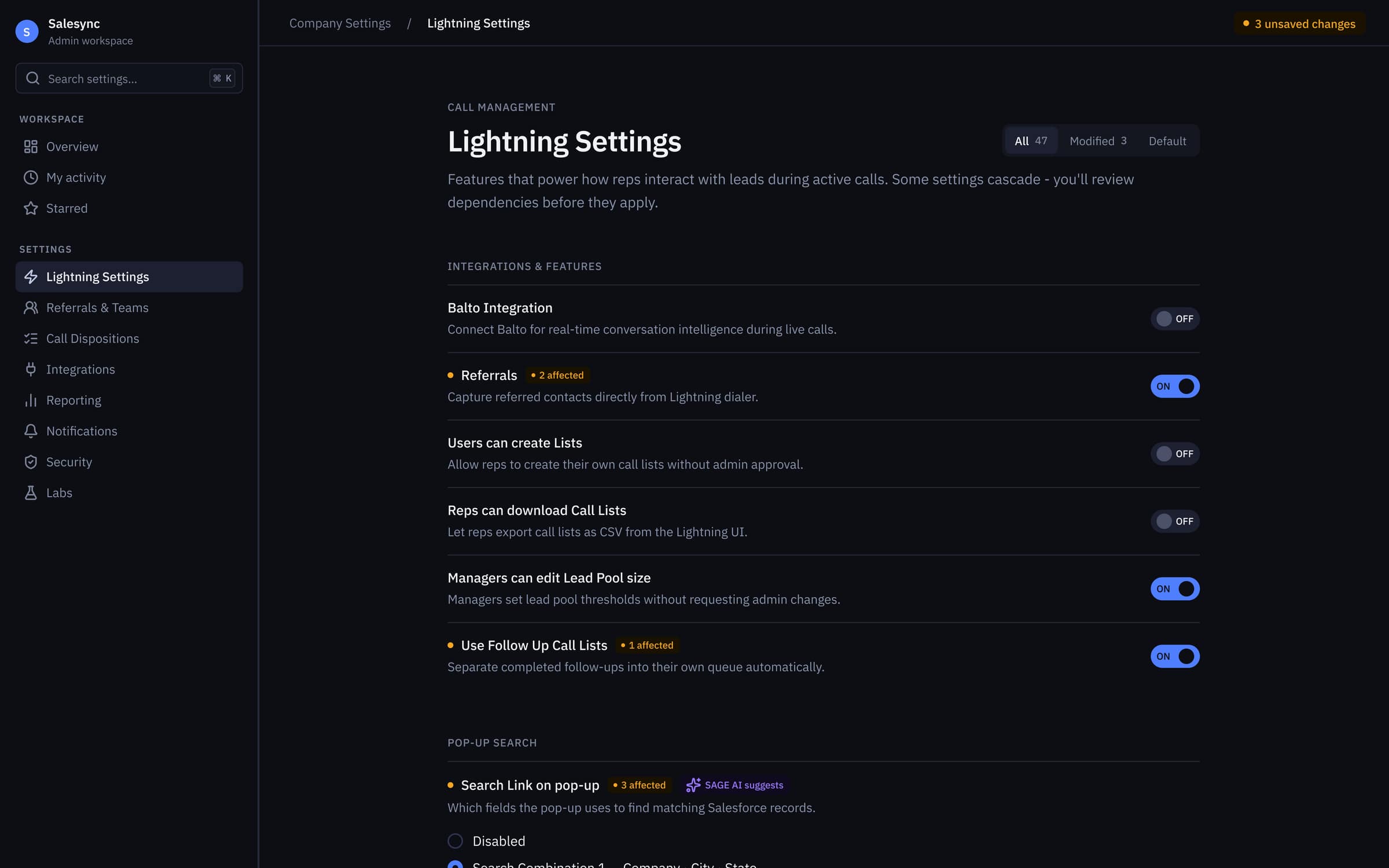
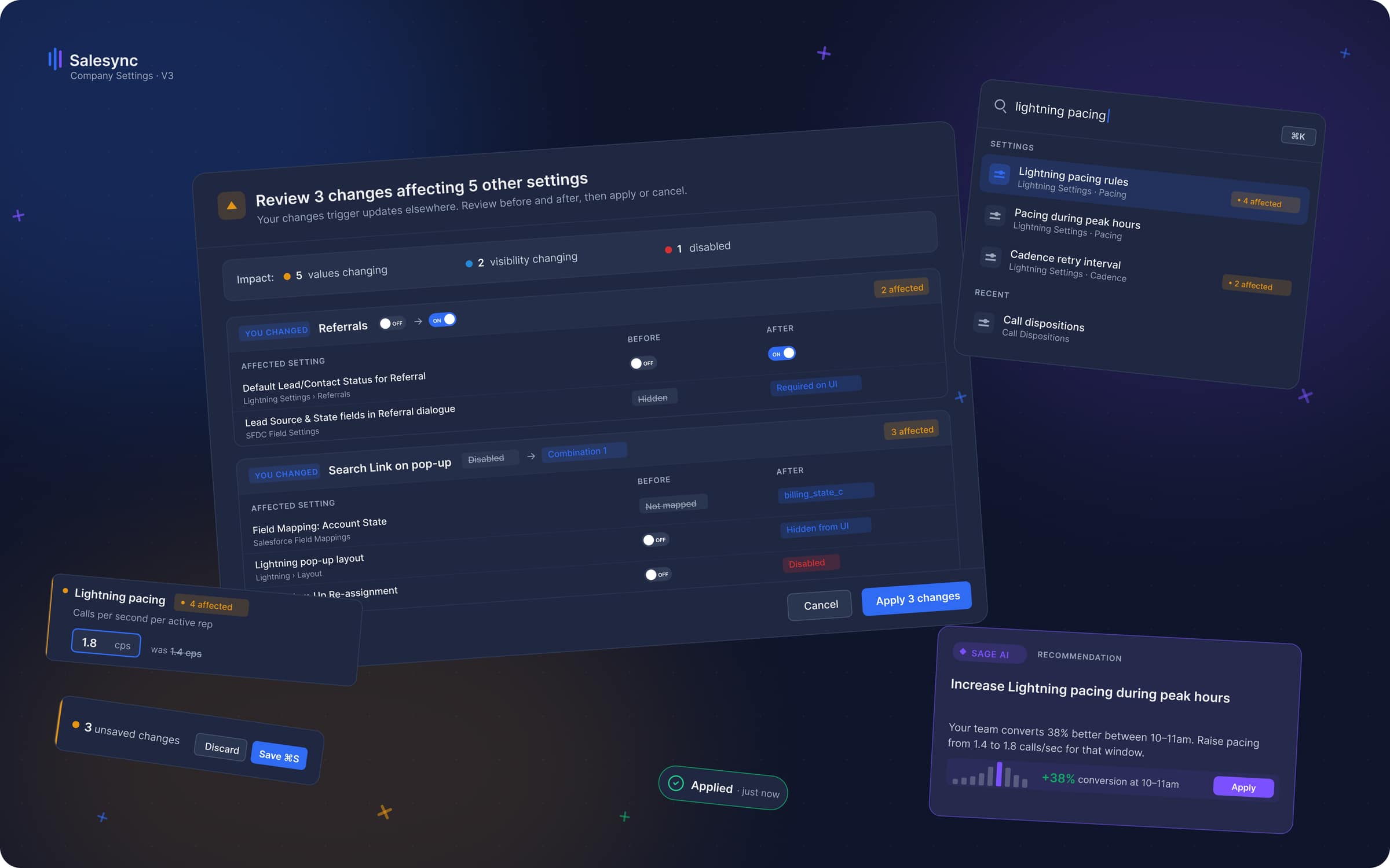
V3 Lightning Settings, every dependent toggle wears an 'N affected' chip, SAGE AI surfaces context-aware suggestions, and unsaved changes are counted in the header.
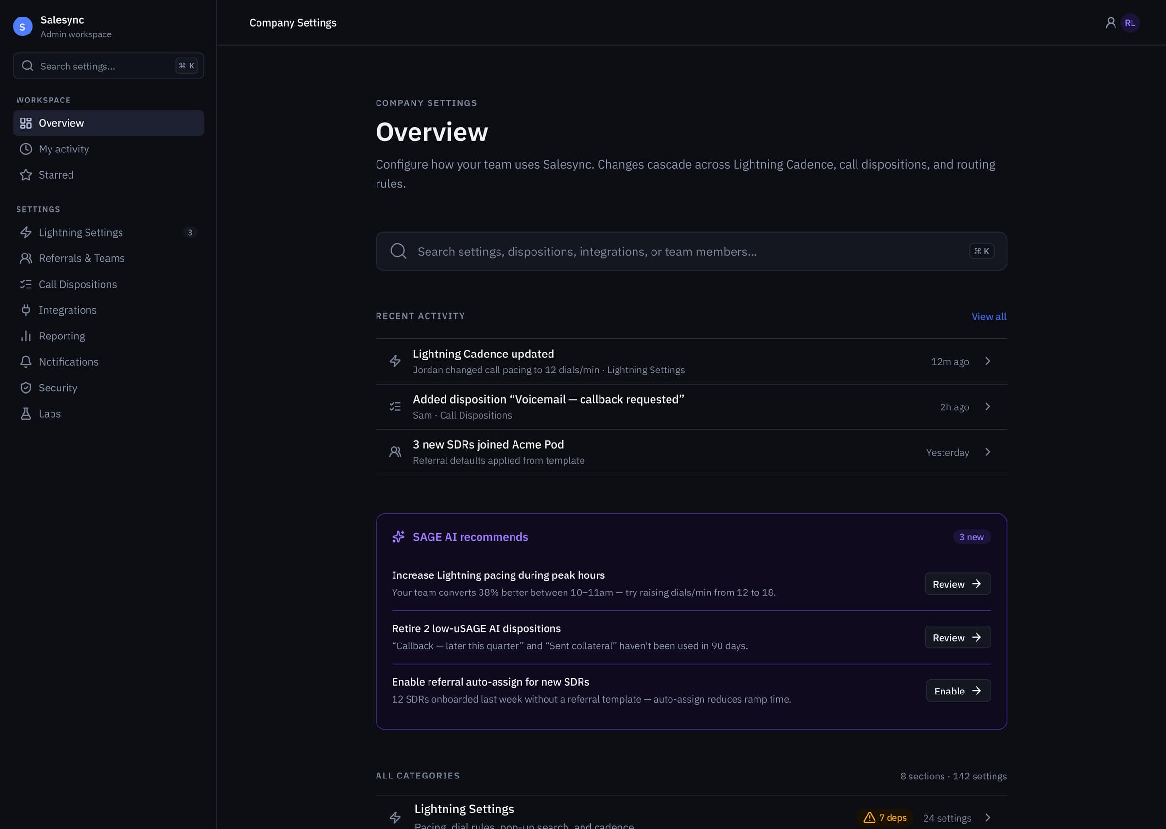
V3 Overview hub, global ⌘K search, recent activity, and a SAGE AI recommendations panel framing the 8 task categories and 142 settings underneath.
rev 03decision
The two patterns.
❝Two patterns do most of the work in V3.
First, a global ⌘K palette. Typing what you want collapses 8 to 22 seconds of scroll-and-scan into under 2. Power admins never touch the sidebar.
Second, dependency-aware save modals. When an edit cascades, say a permission change that reaches billing, the save is intercepted.
The modal shows a before and after diff of everything the change touches. A floating unsaved-state bar sits with it, so the UI is the form's memory.
Together they turn one wrong click rewrites a contract into every consequential save gets reviewed first.
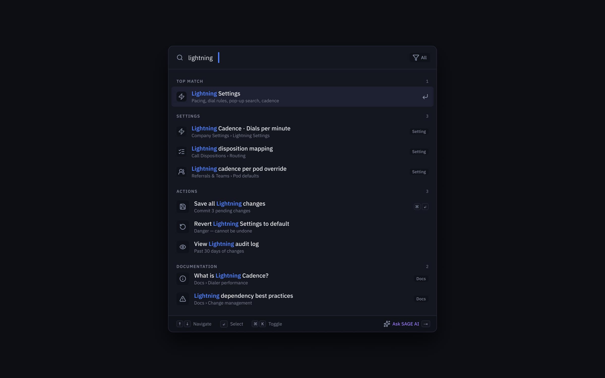
⌘K command palette, typed intent collapses 8–22s of scroll-and-scan into under 2s, with grouped results across Settings, Actions, and Documentation plus an 'Ask SAGE AI' fallback.
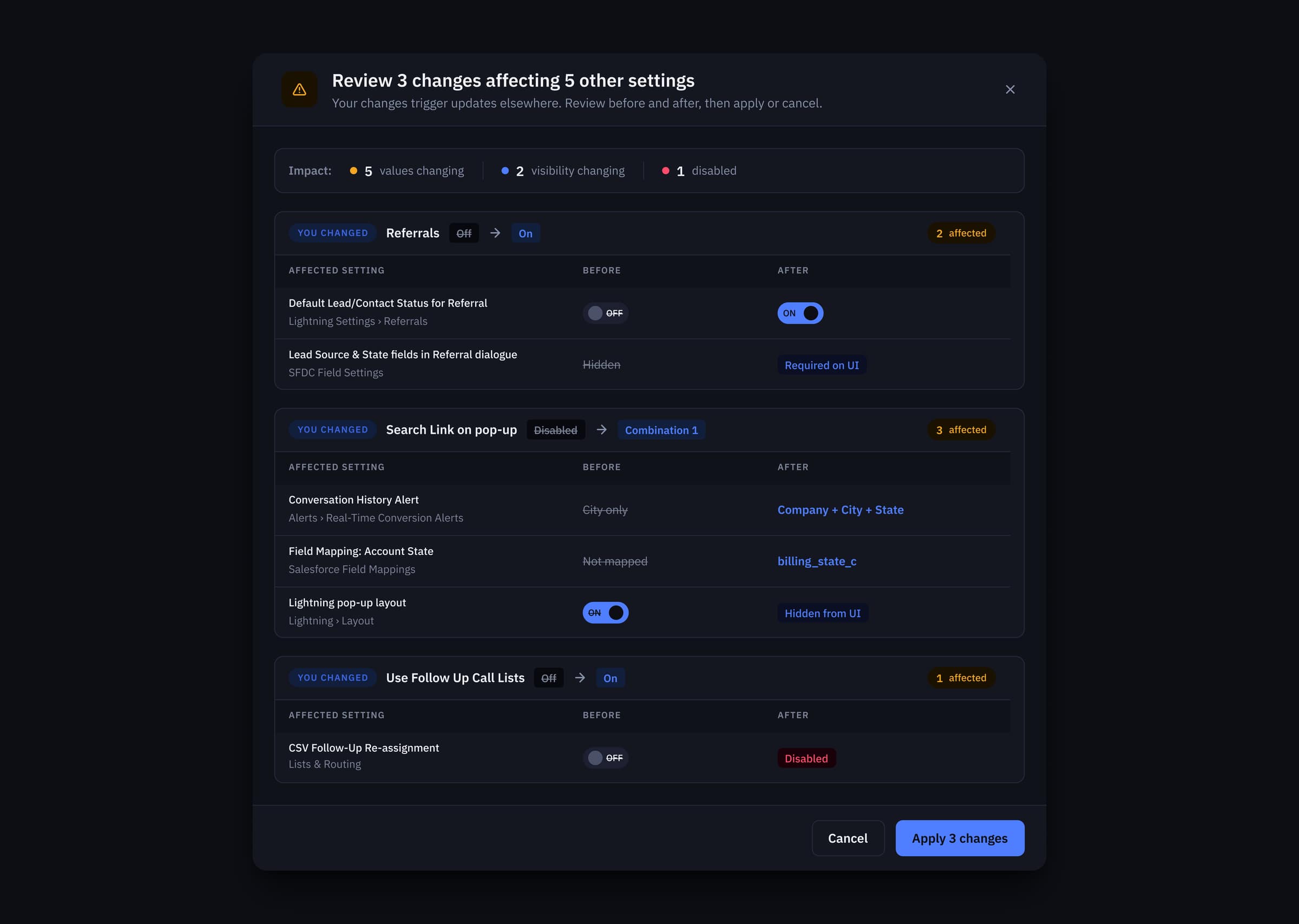
Dependency-review modal, every cascading save is intercepted with an impact summary (values changing, visibility changing, disabled) and a before/after diff on each affected setting before commit.
rev 04decision
The contrast fix.
❝V1's helper text, the copy explaining what each setting did, hit 2.54:1 on the dark canvas. Not borderline. A hard WCAG fail, on the text that explained the most.
I raised one primitive, neutral/200, by two stops.
Every semantic token derived from it, so the fix cascaded through the whole system in one pull request.
Every text-on-background pair passes AA now. Six of eight reach AAA. Primary text lands at 14.8:1, twice the AAA threshold.
Accessibility at the token layer is cheap. At the component layer it is a cleanup pass that never finishes.
Pull-out · Decision
14.8:1
Primary text, 2× AAA
WCAG 2.2 AA requires 4.5:1 for body text; AAA requires 7:1.
rev 05decision
The redesign I built and threw away.
❝Three routes that lost, including one I built in full.
| Row | The option | Why it lost |
|---|---|---|
| V2, by subsystem | A sidebar grouped by the backend each setting came from. Cleaner than the 30-block scroll, and I built the whole thing. | It organised by where a setting came from, not what an admin does with it. The card sort killed it in the first session. |
| Just add ⌘K | Bolt a command palette onto the untouched page. Most of the speed for a fraction of the work. | It only helps someone who already knows the name of what they want. Nothing for discovery, nothing for risk, and risk was the brief. |
| Fix contrast by hand | Hunt down each failing line and raise its colour. The same decision, 142 times. | I raised one primitive two stops instead. Every token built on it inherited the fix in one pull request. |
142 settings were never going to be fixed by arranging them better. There had to be fewer things an admin holds at once.
rev 06build
What I handed over.
❝The original page did not fail because the designer was bad. It failed because no system held it together.
So V3 does not ship as a page. It ships as a contract.
8 section primitives. 3 modal patterns. One token surface.
Every setting an engineer adds in 2027 inherits the contrast, the spacing and the dependency-review behaviour.
The page will get bigger. It will not get worse.
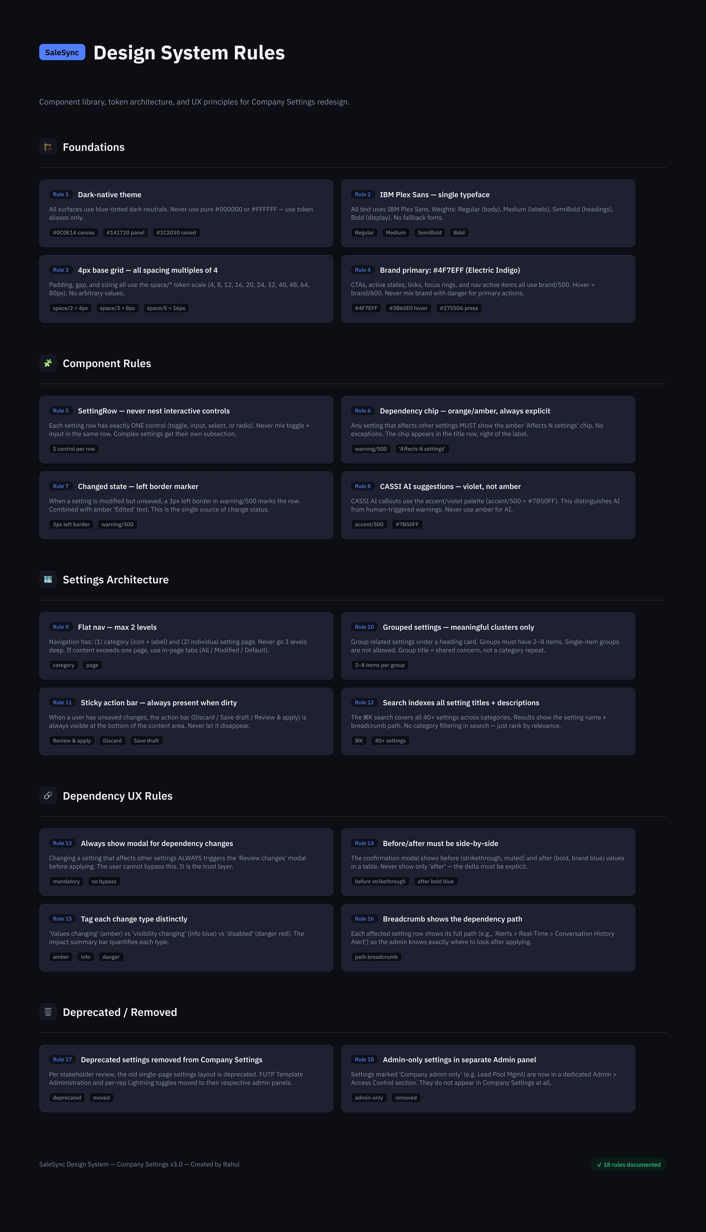
The Settings design-system contract, Foundations, Component Rules, Settings Architecture, Dependency UX Rules, and a Deprecated/Removed registry, so every setting added in 2027 inherits the page's behavior automatically.
rev 07outcome
What happened to it.
❝The work cleared review in three iterations: V1 audit, V2 sidebar, V3 hub. Two exec sponsors, the eng lead and the CS lead aligned. PRD opened in Jira. Design approved for build.
Then the roadmap moved. The build slot went to features with closer revenue ties.
A normal trade-off at any product company, and not one a designer controls. I left Coditas in January 2025 with the V3 spec eng-ready and shelved.
I came back to it on my own in 2026 to finish three things I had left. The dependency-review pattern. The full token-level AA pass. And the SAGE AI recommendations layer, in its own violet token so it can never be read as a system warning.
A 6-engineer team could pick it up tomorrow and inherit the IA, the accessibility floor and the dependency behaviour without re-litigating any of it.
None of it has been built, and two card-sort participants is not a study.
Pull-out · Outcome
3 sponsors
Exec + eng + CS aligned
06. 142 settings → 8 task-based categories. ⌘K for sub-2s typed intent. WCAG 2.2 AA across every token pair. Approved at Coditas; refined independently in 2026.
Want this kind of work on your team?